Global cause of death, illustration
Numéro d’image : 13743964
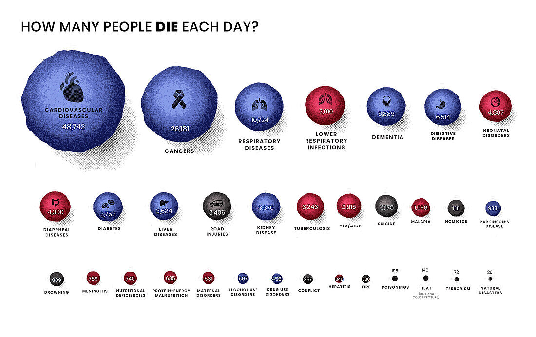
| Infographic illustration depicting daily cause of death around the world. The number of deaths per day is indicated by the relative size of the spheres. Blue spheres correspond to non-communicable diseases (e.g. cancer, heart attacks, stroke etc) , red spheres correspond to communicable, neonatal and nutritional diseases (e.g. influenza, HIV/AIDS, malaria etc) and grey represents deaths through injury. Nearly 150, 000 people die each day. Cardiovascular diseases are the leading cause of death globally. The second biggest cause are cancers. Based on 2019 figures from Our World in Data. | |
| Licence : | Libre de droits |
| Crédit: | Science Photo Library / VISUAL CAPITALIST |
| Model Release : | Non requis |
| Property Release : | Non requis |
| Restrictions : | - |
Prix pour cette image À partir de 29 €
Pour une utilisation numérique (72 dpi)
À partir de 29 €
Pour un usage d'impression (300 dpi)
À partir de 325 €
Mots clés
- aucun,
- blessure,
- cancer,
- cause du décès,
- data,
- décés,
- décès,
- donnée,
- entier,
- généré digitalement,
- généré numériquement,
- global,
- illustration,
- image créée par ordinateur,
- image de synthèse,
- infographique,
- maladie,
- maladie infectieuse,
- maladies cardiovasculaires,
- mort,
- mortalité,
- morts,
- mourir,
- néonatale,
- oeuvre,
- personne,
- texte,
- visualisation,
- visualisation des données