TOMS total ozone maps,1979-82,89-92
Numéro d’image : 11736330
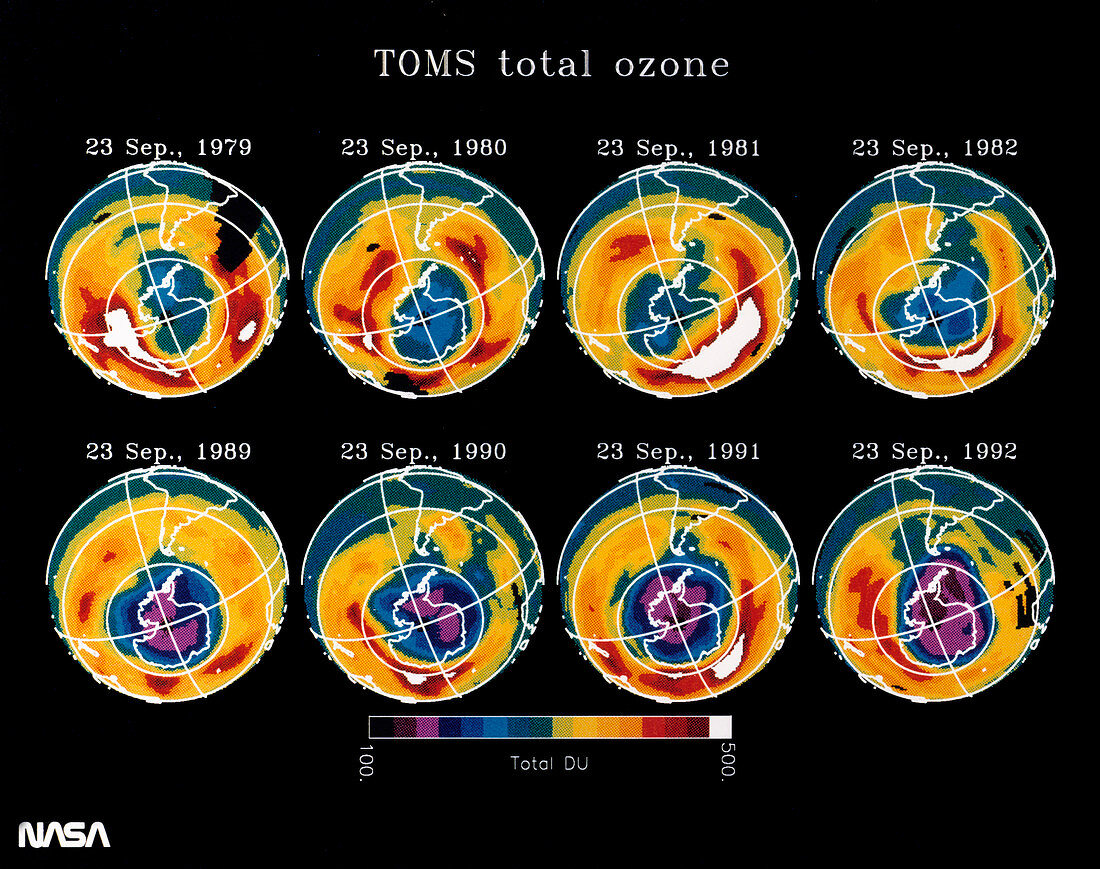
| Growth of the Antarctic ozone hole. Series of false-colour maps of total atmospheric ozone,comparing the distribution on 23 September for the years 1979-82 (l-r,top) with 1989-92 (l-r,bottom). The colours represent ozone concentration,from white (highest) through red,yellow,green and blue to purple (lowest). The maps of 1979-82 show ozone depletion (blue) over the Antarctic. The maps for 1989-92 show deeper and far more widespread depletion of ozone over the same region (purple),with the worst case being 1992. Ozone depletion has been linked to man-made chemicals such as CFCs. Data from the TOMS spectrometer on the Nimbus-7 satellite | |
| Licence : | Droits gérés |
| Crédit: | Science Photo Library / NASA |
| Taille de l’image : | 3543 px × 2798 px |
| Model Release : | Non requis |
| Property Release : | Non requis |
| Restrictions : | - |
Prix pour cette image À partir de 45 €
Produit vendu
(Calendrier, Carte postale, Carte de vœux, Impression sur textile, Packaging etc)
À partir de 45 €
Usage commercial
(Affichage, Annonce presse, Annonce TV, Carte, Digital - hors rés. sociaux, Digital - rés. sociaux etc)
À partir de 45 €
Éditorial
(Digital, Journal, Livre, Livre pratique, Magazine, Télévision etc)
À partir de 60 €
Usage non-commercial
(Digital - hors rés. sociaux, Digital - rés. sociaux etc)
À partir de 120 €