Mercator map projection,diagram
Numéro d’image : 11621226
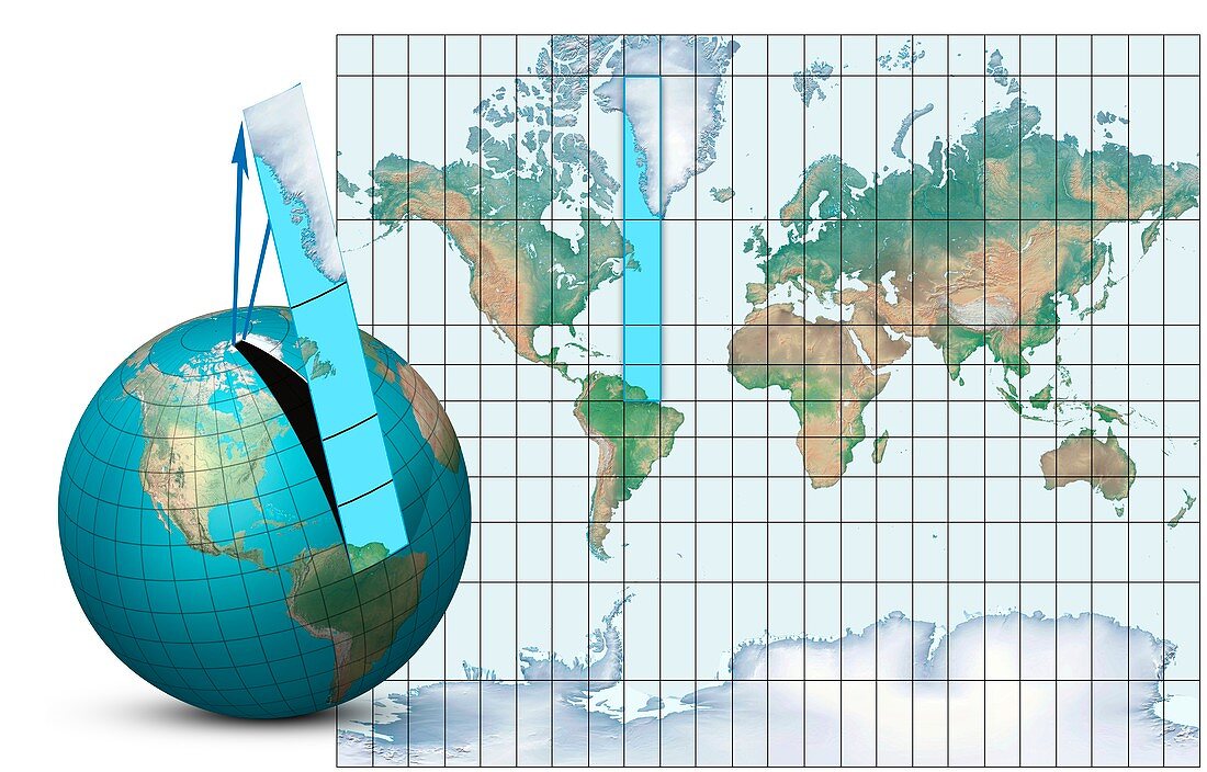
| Mercator map projection. Diagram of an Earth globe (left) and a Mercator map projection (right) with the blue strip (from South America to Greenland) showing how the spherical surface is projected onto a cylindrical map. The arrows (blue) show how the polar regions are narrower on the globe,and wider on the map. This is one of the disadvantages of this projection,which distorts the polar regions compared to the equatorial regions. Greenland and Antarctica appear much larger on the map than on the globe. This standard projection is named for the Flemish geographer and cartographer Gerardus Mercator who used it in 1569 | |
| Licence : | Droits gérés |
| Crédit: | Science Photo Library / Lunau, Claus |
| Taille de l’image : | 5906 px × 3780 px |
| Model Release : | Non requis |
| Property Release : | Non requis |
| Restrictions : | - |
Prix pour cette image À partir de 45 €
Produit vendu
(Calendrier, Carte postale, Carte de vœux, Impression sur textile, Packaging etc)
À partir de 45 €
Usage commercial
(Affichage, Annonce presse, Annonce TV, Carte, Digital - hors rés. sociaux, Digital - rés. sociaux etc)
À partir de 45 €
Éditorial
(Digital, Journal, Livre, Livre pratique, Magazine, Télévision etc)
À partir de 60 €
Usage non-commercial
(Digital - hors rés. sociaux, Digital - rés. sociaux etc)
À partir de 120 €
Mots clés
- carte,
- cartographie,
- cartographié,
- cartographier,
- cartographique,
- cylindre,
- cylindrique,
- équatorial,
- flèche,
- flèches,
- géographie,
- géographique,
- géométrie,
- géométrique,
- globe,
- illustration,
- mathématique,
- mathématiques,
- oeuvre,
- planète,
- projecter,
- projection,
- projection de Mercator,
- projection Mercator,
- rectangle,
- rectangulaire,
- schéma,
- sphère,
- sphérique,
- terre,
- tordu