Map showing changes in global nitrogen dioxide concentration
Numéro d’image : 13613621
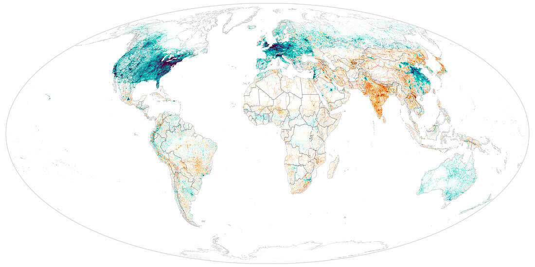
| Map showing changes in annual average nitrogen dioxide concentration from 2000 to 2019. Purple areas on the map show places with a decrease in nitrogen dioxide concentration of 5 million parts per billion whilst red areas show areas with an increase in nitrogen concentration of 3 million parts per billion. Increases in nitrogen dioxide in cities has been linked to an increase in paediatric asthma. Data used to create this map was obtain using a land regression model and data collected from the Ozone Monitoring Instrument on the Aura satellite. | |
| Licence : | Droits gérés |
| Crédit: | Science Photo Library / NASA |
| Taille de l’image : | 7200 px × 3600 px |
| Model Release : | Non requis |
| Property Release : | Non requis |
| Restrictions : | - |
Prix pour cette image À partir de 45 €
Produit vendu
(Calendrier, Carte postale, Carte de vœux, Impression sur textile, Packaging etc)
À partir de 45 €
Usage commercial
(Affichage, Annonce presse, Annonce TV, Carte, Digital - hors rés. sociaux, Digital - rés. sociaux etc)
À partir de 45 €
Éditorial
(Digital, Journal, Livre, Livre pratique, Magazine, Télévision etc)
À partir de 60 €
Usage non-commercial
(Digital - hors rés. sociaux, Digital - rés. sociaux etc)
À partir de 120 €