Detecting exoplanets, diagram
Numéro d’image : 13405680
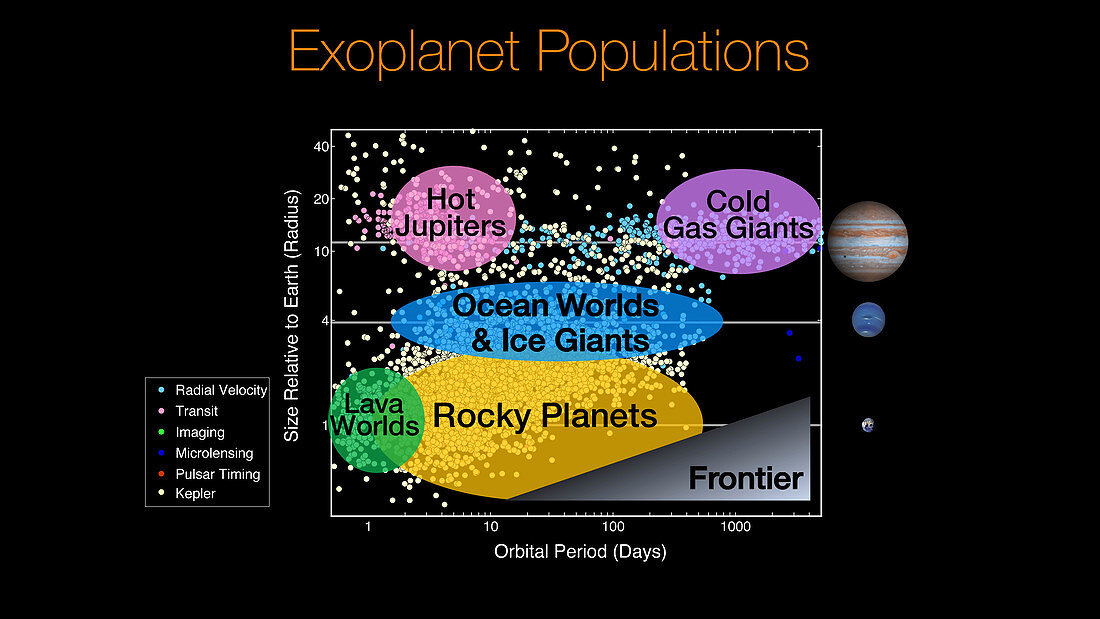
| Diagram comparing the population of exoplanets detected by the Kepler mission (yellow dots) to those detected by other surveys using various methods (key, left). The horizontal lines mark the sizes of Jupiter, Neptune and Earth, which are displayed on the right side of the diagram. The coloured ovals denote different types of planets. The lower gray triangle represents future frontier surveys. The Kepler mission, which was launched in March 2009, was designed to discover Earth-like planets orbiting other stars. Its initial 3.5 year mission was extended to over 9 years, during which time it surveyed over 500, 000 stars, detecting more than 2, 600 planets. The space observatory was retired on 30th October 2018 after it ran out of fuel. | |
| Licence : | Droits gérés |
| Crédit: | Science Photo Library / Wendy Stenzel / Natalie Batalha / Ames Research Center / NASA |
| Taille de l’image : | 5573 px × 3135 px |
| Model Release : | Non requis |
| Property Release : | Non requis |
| Restrictions : | - |
Prix pour cette image À partir de 45 €
Produit vendu
(Calendrier, Carte postale, Carte de vœux, Impression sur textile, Packaging etc)
À partir de 45 €
Usage commercial
(Affichage, Annonce presse, Annonce TV, Carte, Digital - hors rés. sociaux, Digital - rés. sociaux etc)
À partir de 45 €
Éditorial
(Digital, Journal, Livre, Livre pratique, Magazine, Télévision etc)
À partir de 60 €
Usage non-commercial
(Digital - hors rés. sociaux, Digital - rés. sociaux etc)
À partir de 120 €
Mots clés
- astronomie,
- astronomique,
- aucun,
- comme la terre,
- comme une terre,
- détecter,
- détection,
- enquêter,
- enquêtes,
- étiqueté,
- étiquette,
- étiquettes,
- étudier,
- examiner,
- exoplanète,
- frontalier,
- frontière,
- graphiques,
- Jupiter,
- Kepler,
- label,
- marqué,
- neptune,
- personne,
- planètes,
- radial,
- représentation,
- science planétaire,
- terre,
- texte,
- transit,
- vélocité,
- vitesse