Antarctica air temperature anomalies, 2017-2022
Numéro d’image : 13765216
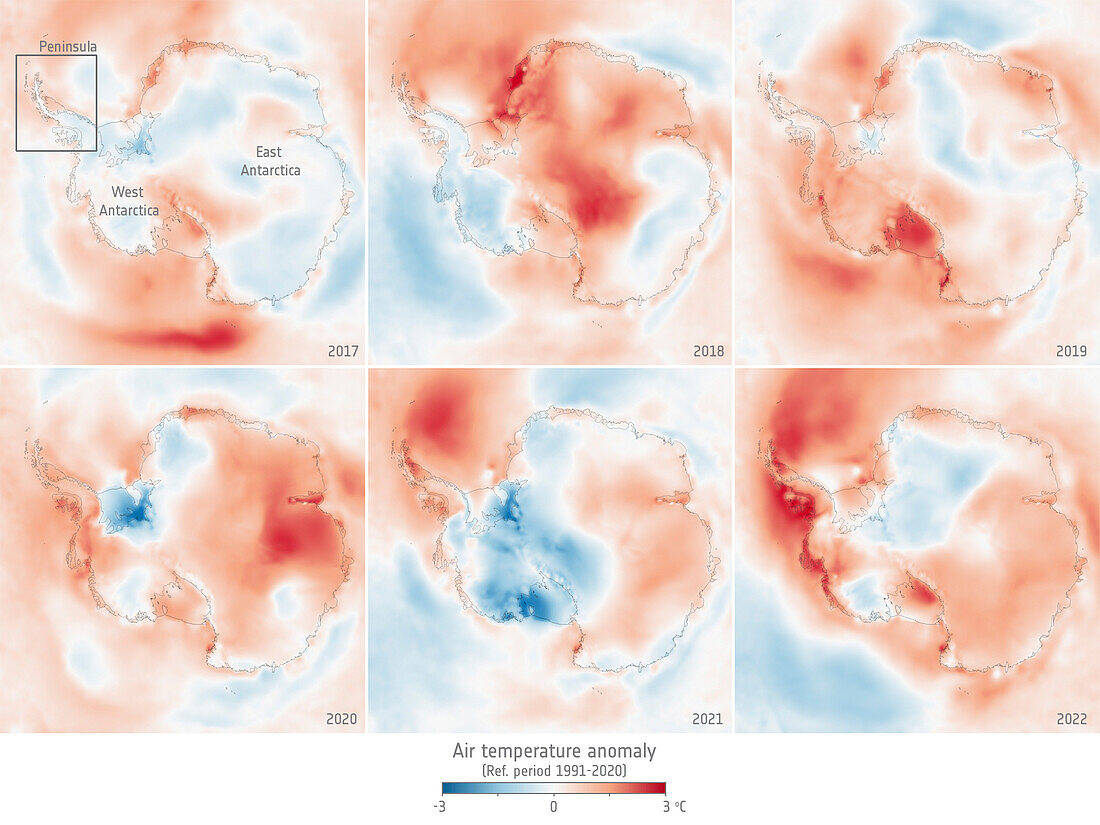
| Antarctica air temperature anomalies. These maps show average air temperatures from 2017 (top left) to 2022 (bottom right) over the Antarctic compared to the 1991-2020 average. Blue areas are colder than average, while pink and red areas are warmer than average. | |
| Licence : | Droits gérés |
| Crédit: | Science Photo Library / ESA |
| Taille de l’image : | 1920 px × 1440 px |
| Model Release : | Non requis |
| Property Release : | Non requis |
| Restrictions : |
|
Prix pour cette image À partir de 45 €
Produit vendu
(Calendrier, Carte postale, Carte de vœux, Impression sur textile, Packaging etc)
À partir de 45 €
Usage commercial
(Affichage, Annonce presse, Annonce TV, Carte, Digital - hors rés. sociaux, Digital - rés. sociaux etc)
À partir de 45 €
Éditorial
(Digital, Journal, Livre, Livre pratique, Magazine, Télévision etc)
À partir de 60 €
Usage non-commercial
(Digital - hors rés. sociaux, Digital - rés. sociaux etc)
À partir de 120 €
Mots clés
- 2000,
- 2010,
- 2017,
- 2018,
- 2019,
- 2020,
- 2021,
- 2022,
- 21ème siècle,
- air,
- anomalie,
- anomalies,
- Antarctique,
- Antartica,
- aucun,
- carte,
- cartes,
- changement climatique,
- climat,
- comparaison,
- comparer,
- de l'espace,
- environnement,
- glace,
- image satellite,
- moyenne,
- personne,
- réchauffement climatique,
- température,
- texte,
- XX1ème siècle